Excel - Part3
FEF1002 - Lecture6
Week 6: Excel - Part3
This module will cover the following concepts:
- Tables and Charts in Excel
Tables and Charts in EXCEL
Pivot Tables
Excel Pivot table is a method used to quickly create reports from list-formatted data and compare data. Pivot Tables, one of Excel’s most frequently used features, are extensively used in creating Reporting screens.
Pivot Tables, where we can create reports by dragging and dropping table headers into row and column areas, have become an even more powerful and indispensable Excel feature with the features developed with new Excel versions. Pivot Tables have a very wide usage area, from comparing monthly sales values of salespeople to reporting monthly expenses of vehicles, and are an indispensable tool in managers’ Excel usage.
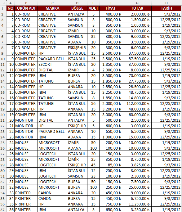
There are certain conditions for creating a Pivot Table from Excel data:
- Your data must be listed downward in columns.
- Should not contain empty rows or columns.
- When you create a Pivot Table from a table with continuous data entry, when you add a new row and refresh the data, your Pivot Table automatically updates.
- Data types in columns should be of the same type. For example, if a column has a date header, that column should only contain date values.
Let’s look at the following example
You can use file ornek4.xlsx for the following examples
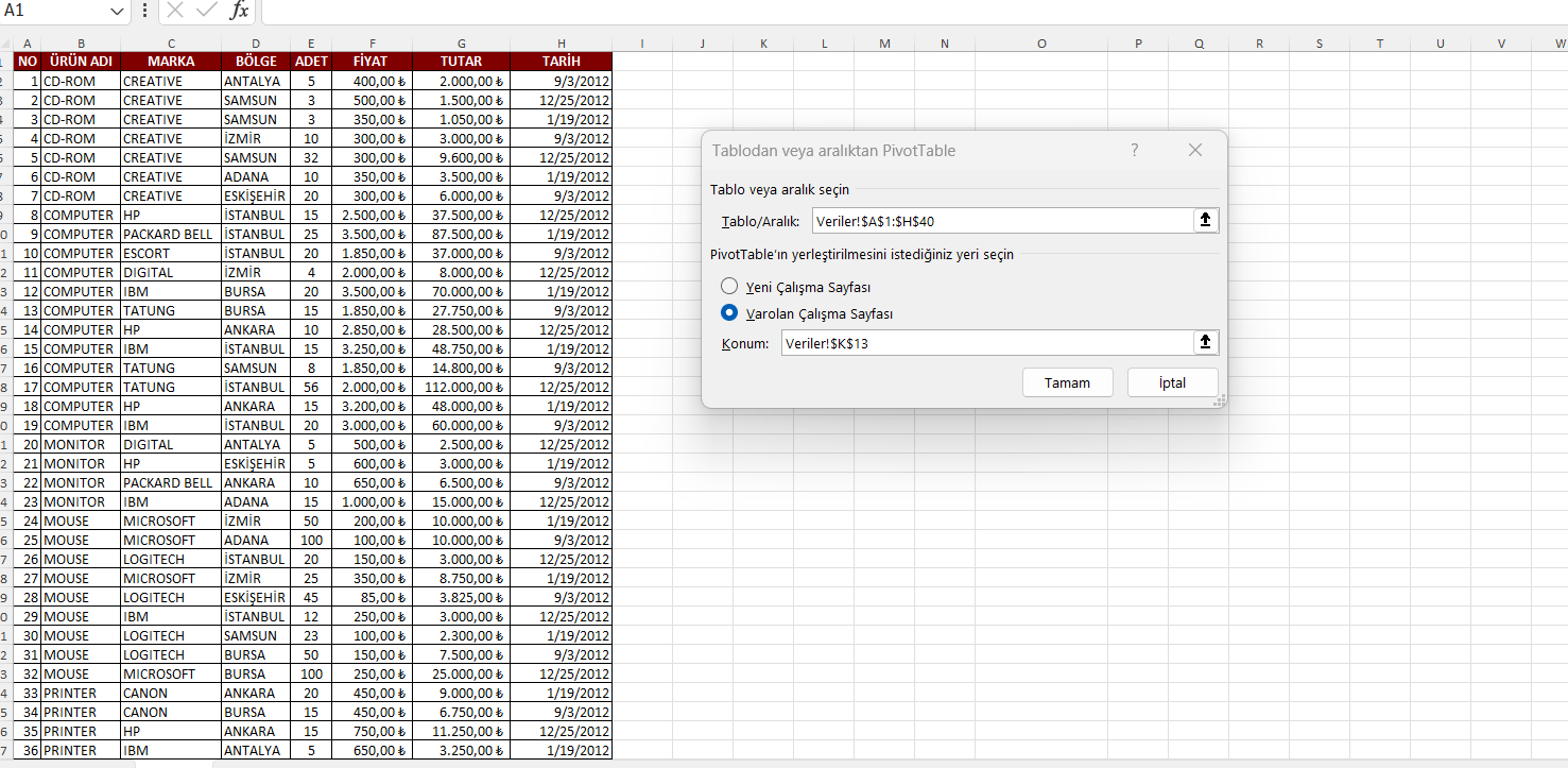
Research Question: How many sales were made in each region?
Insert–>Pivot Table–>Select Table/Range option and select all data range.
When you select the desired information from the Pivot Table fields on the right side, the pivot table appears.
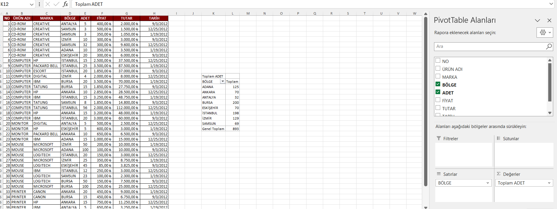
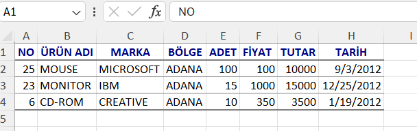
In this pivot table, for example, 125 sales were made in Adana. If you click on 125, you can see the details of the sales on a separate page.
Research Question: How many sales were made by region and month, and what is the total amount?
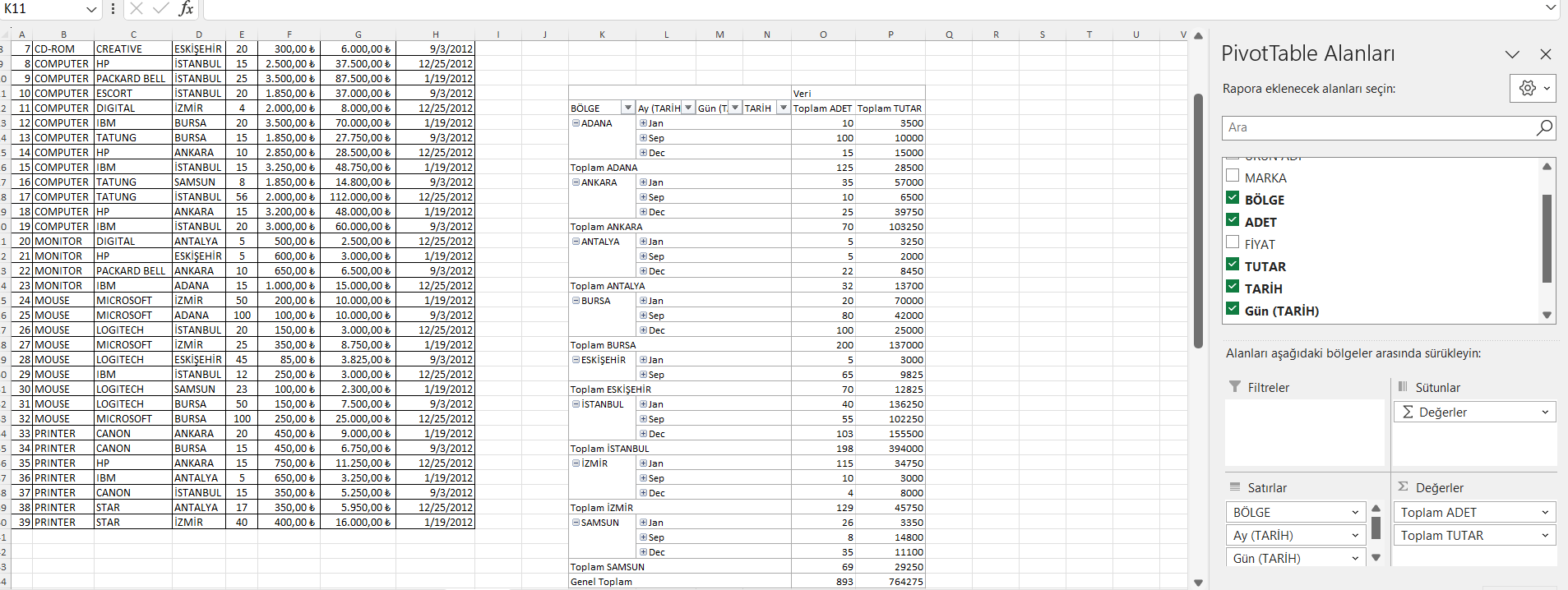
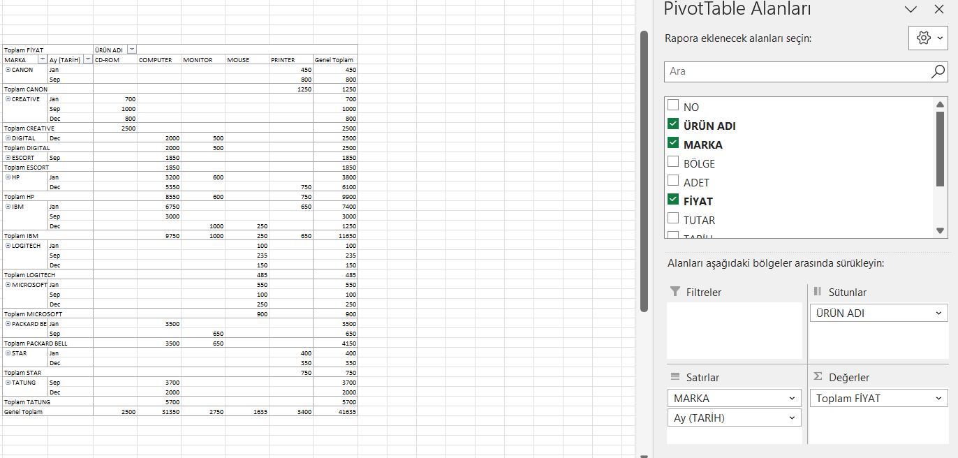
You can choose the row and column yourself. For example, we click on the brand on the right and drag it to row instead, so it separates by brands. When you select brand and price, a table like below can be created.
Charts
There are three basic chart types you can create in Excel, and they’re all very suitable for specific data types:
Line - Displays one or more data sets using vertical bars. Can be used to list changes over time or compare two similar data sets
Column - Displays one or more data sets using horizontal lines. Can be used to show growth or decline in data over time
Pie - Displays a data set as parts of a whole. Can be used to show the visual distribution of data
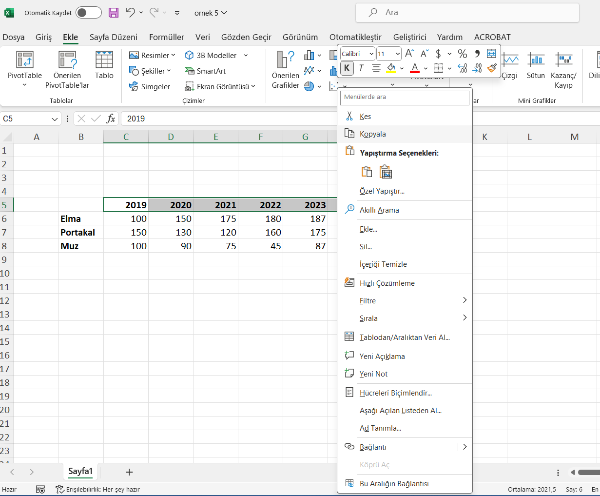
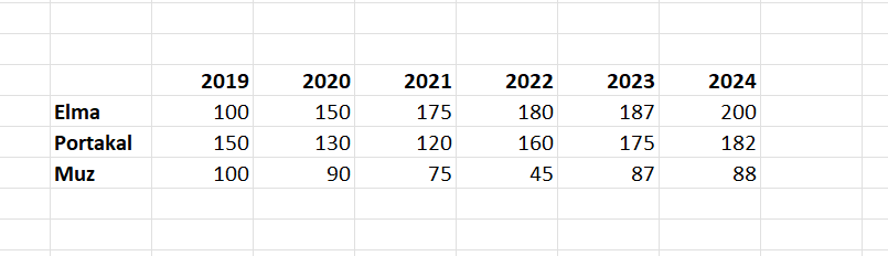
Let’s consider the following data set. We can create a chart by selecting all data and using the Insert–>Recommended Charts tab.
You can use file ornek5.xlsx for the following examples
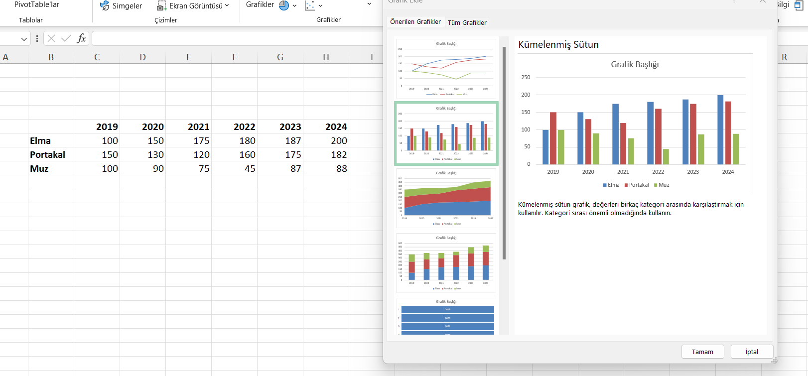
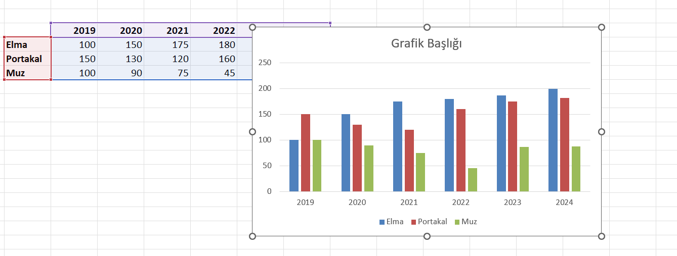
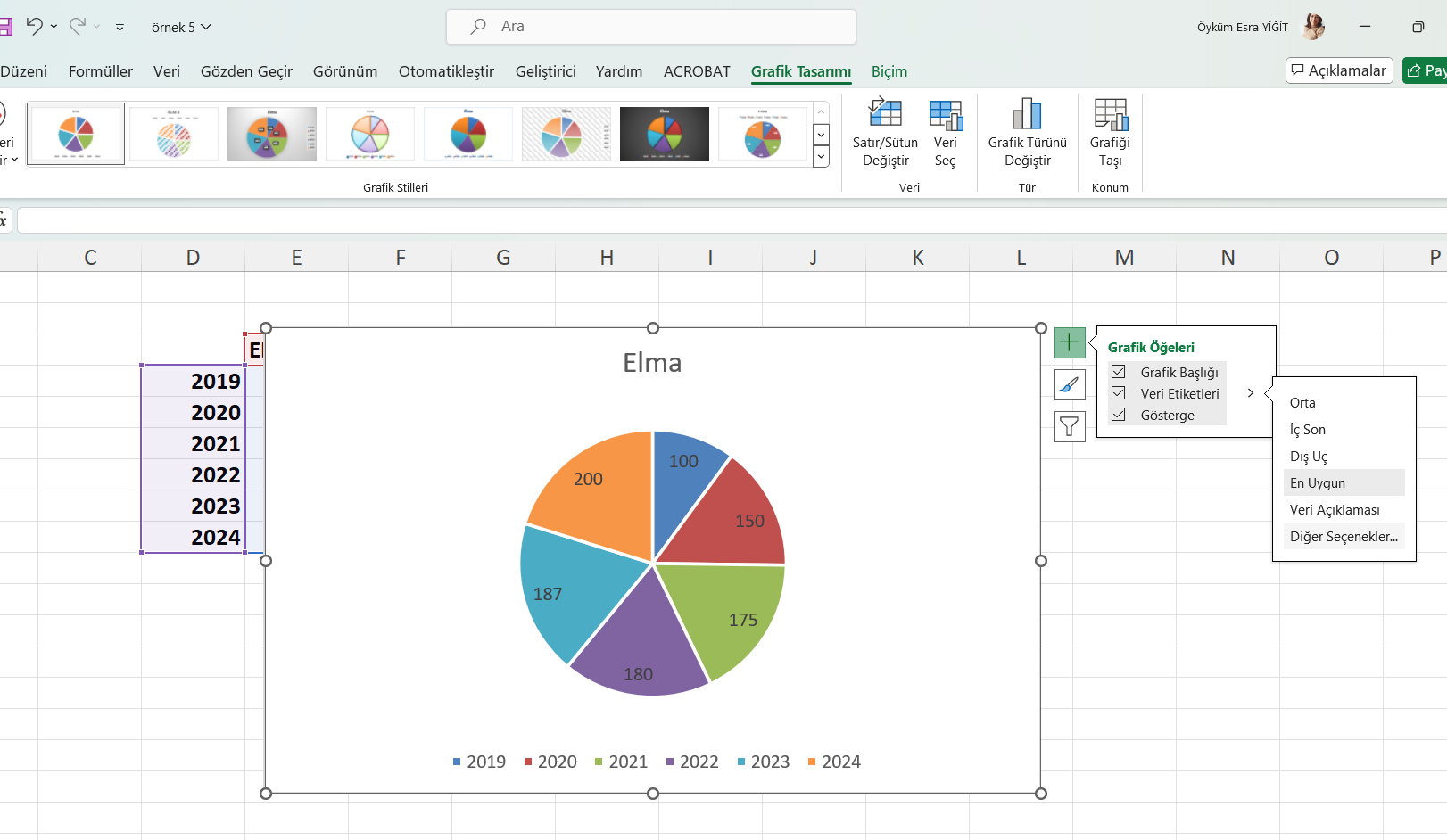
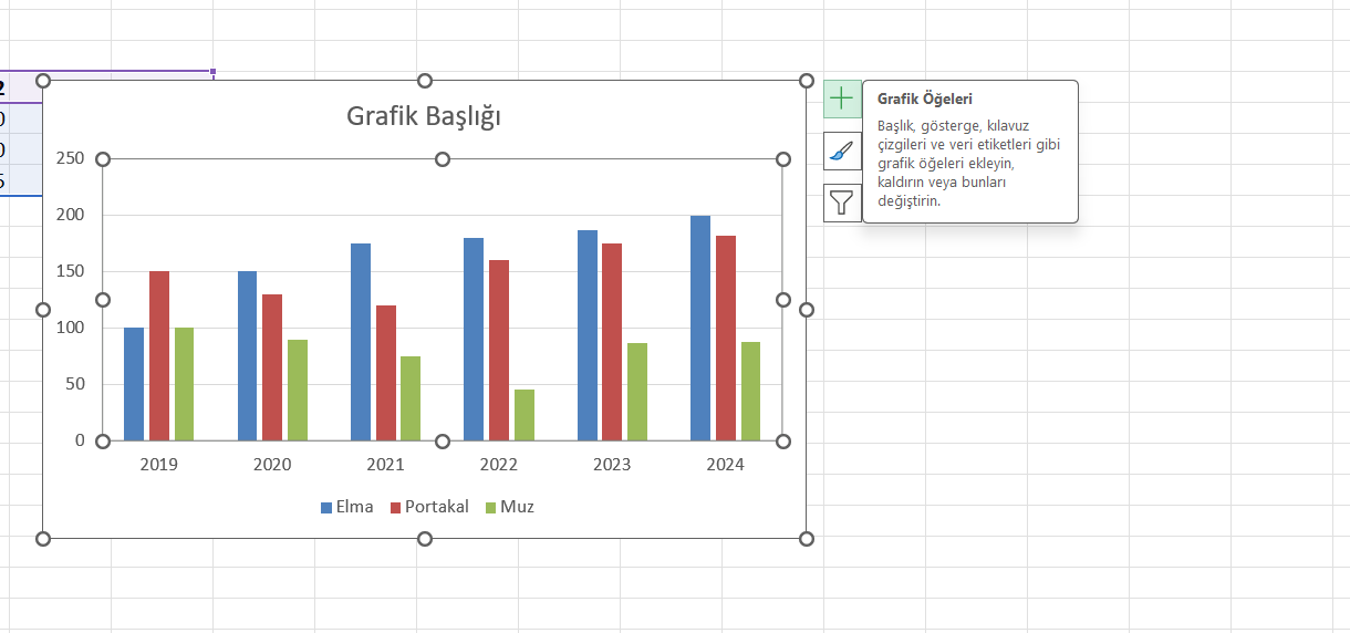
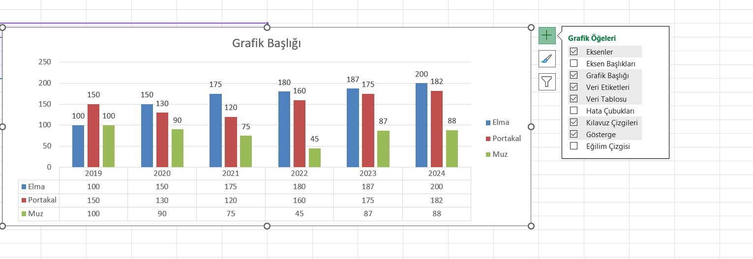
From chart elements, adjustments can be made to the chart.
Let’s try a different chart for the example above.
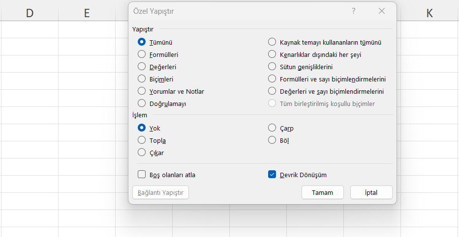
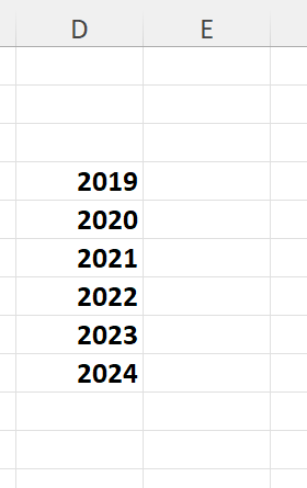
Select and copy the row containing dates and paste it to a different area using special paste–>transpose
Repeat the same process by selecting the apple row.
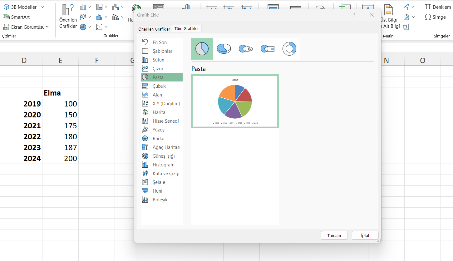
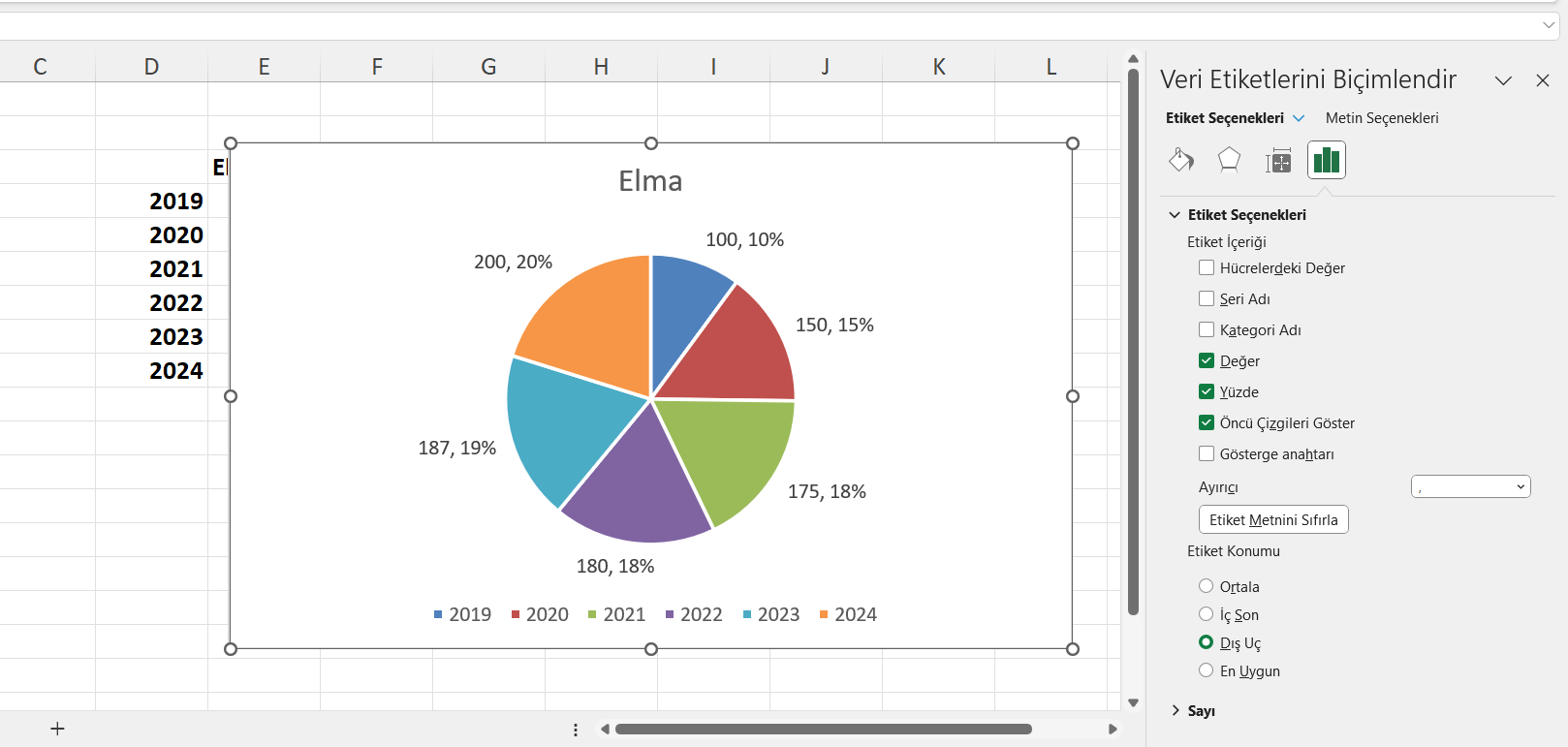
Afterward, we can select the pie chart and modify the data labels as desired.